Introducing Waitwhile 3.0, the future of customer flow management 🚀
Waitwhile 3.0 is the new generation of Waitwhile and we’ve begun the rollout after years in the making. It’s blazingly fast, with a sleek new interface that makes managing your customer flows easier than ever.
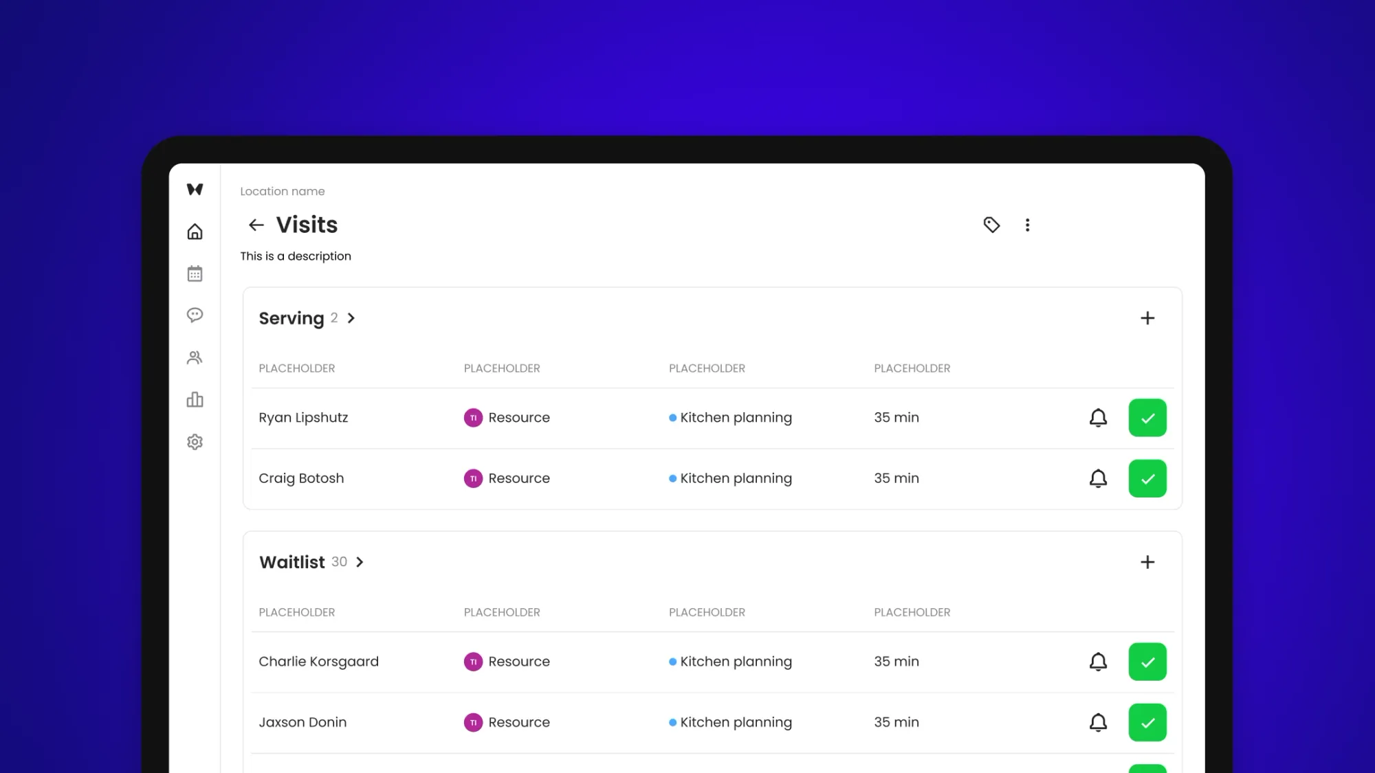
Every day, Waitwhile is helping thousands of companies like Louis Vuitton, Best Buy, Hartford Healthcare and Applebee’s to deliver better customer flows for over 200M people.
In 2020 we launched Waitwhile 2.0 and set a new standard for virtual queuing, appointments and customer flow management everywhere.
Since then, our customers have expressed their desire for Waitwhile to power an even wider range of customer flows with increased flexibility. We’ve also talked to hundreds of frontline team members who oversee guest lines and appointments in Waitwhile every day to find ways to simplify their workflows through automation and better design. Finally, we partnered with our largest Enterprise customers to create solutions that cater to their complex configurations and reporting needs across thousands of locations.
Based on this feedback, we’re now ready to unveil the next generation of Waitwhile. Here’s what you can expect and how to get started!
The (really) short version
Waitwhile 3.0 ships with:
✅ A new Visits Management interface, a unified mission control for all your customer flows with a new board layout - and more!
✅ A brand new Appointment Management experience which sets new standards of usability and speed.
✅ New guest-facing public pages that unveil web notifications as a new communication channel, and even greater styling and customization capabilities.
✅ A new Analytics & Reporting engine to help you optimize your business.
→ Try the new version today at new.waitwhile.com.
We will be sunsetting the Waitwhile 2.0 version on Dec 31, 2023 at which time Waitwhile 3.0 will move to app.waitwhile.com.
Meet Visits, your mission control
We’re introducing Visits, a new mission control that gives you a complete overview of your waitlist, bookings and flows at a glance. This helps your staff more efficiently manage your guests in one place with fewer clicks.
A new Board layout
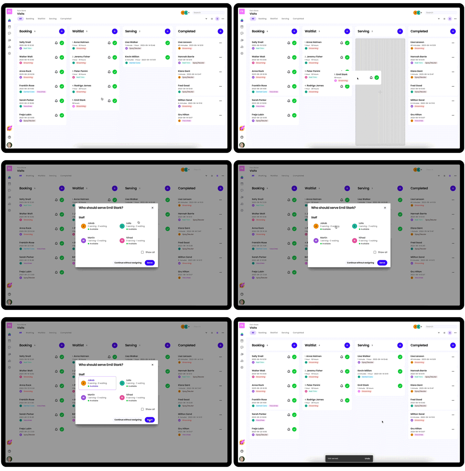
You can choose to view all your visits as either a List or a Board. We think you’ll find the Board view really helpful to orient and progress your visits.
Focus on your waitlist, or step back
If you want to just view only the visits in your waitlist or those being served, just click one of the tabs to enter into the focused mode. This will allow your staff to focus on just one state at a time and is similar to the current Waitlist page.
Then when you want to step back and see the whole picture, just click All to zoom out again.
Drag and drop
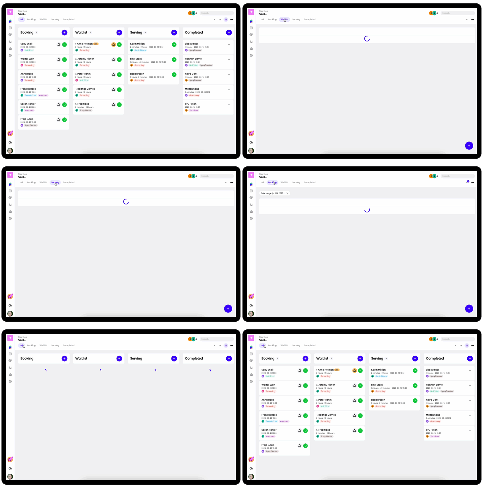
Now you can drag & drop visits to change their place in line or to advance it in the flow. Super easy!
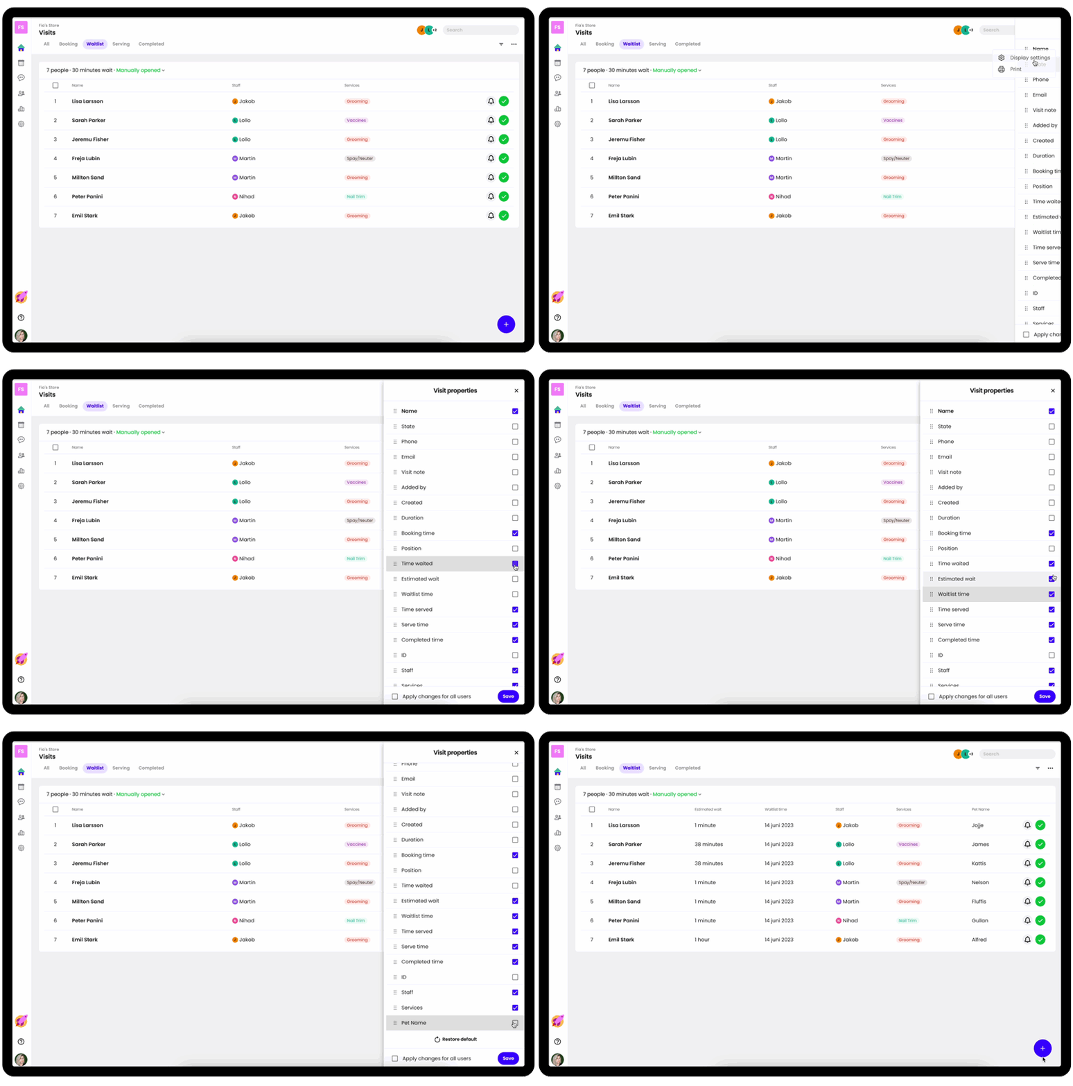
Customize what fields to display in your list
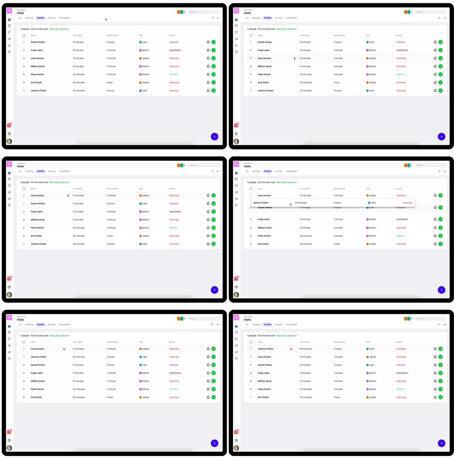
Now you can choose what fields you want to show in your waitlist or for your bookings.
Is the guest’s Ticket Number more important than their Name? Now you can make that the primary field that shows first in your list! You can also choose which other columns you’d like to display and hide the stuff that doesn’t matter.
Manage your Resources easily
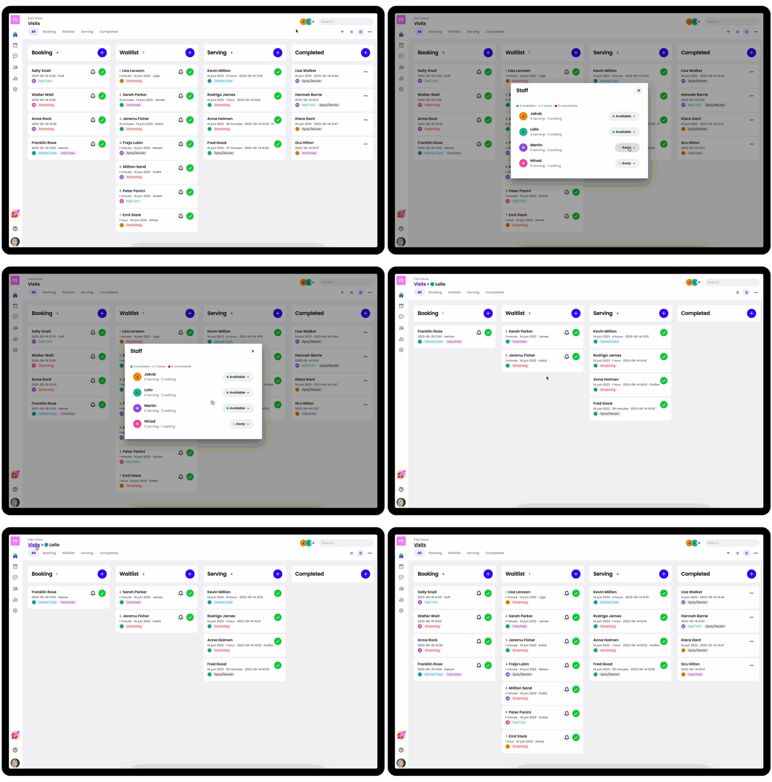
Waitwhile makes it easy to manage all your staff, rooms and other resources for your customer flows. Now we’ve brought the Resource Overview directly into your Visits experience so you can manage everything in one place.
Just click the Resources button to bring up your available resources. Here you can manage their availability and focus on just one of your resources.
When focusing on a Resource you get a filtered view of your Visits page and makes it easy to assign a visit to the resource.
Filtering, leveled up
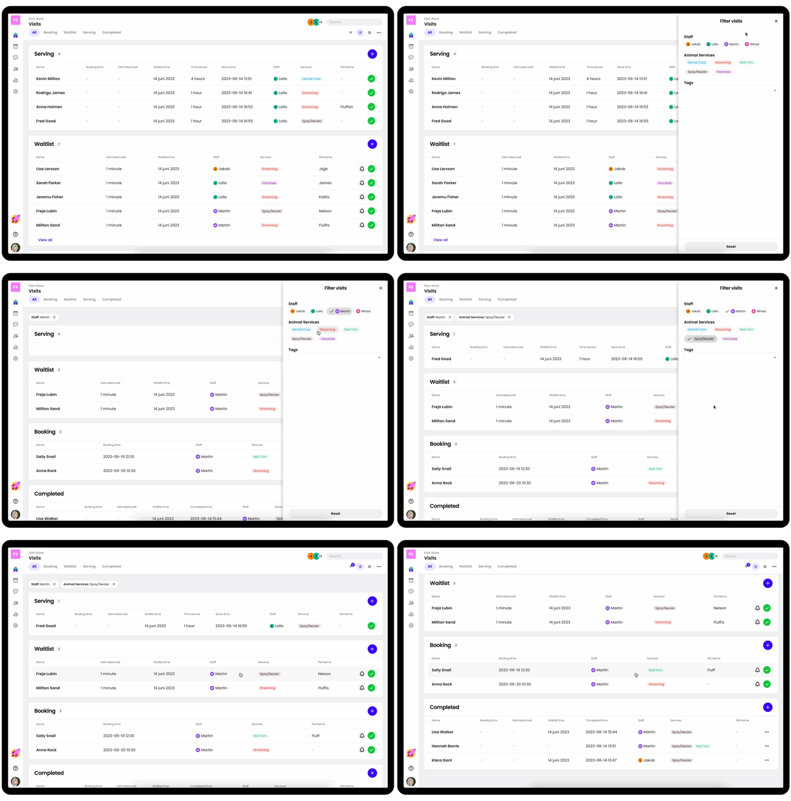
If you want to view only a certain subset of your visits based on the staff member, service, status and more, you now can!
Just open the Filter menu and apply the relevant filters so that you can focus on what matters, right now.
A brand new Booking Experience
New calendar
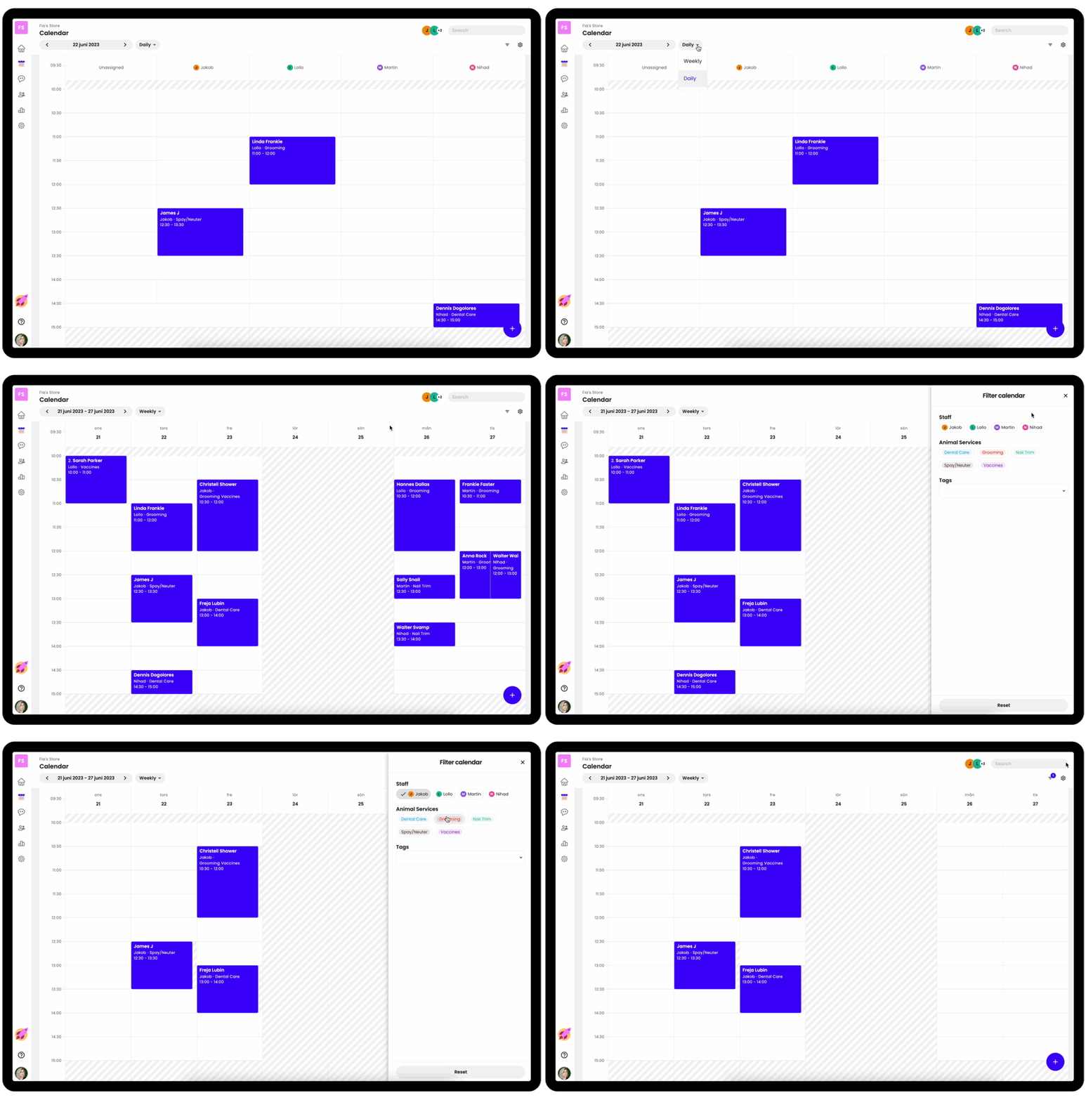
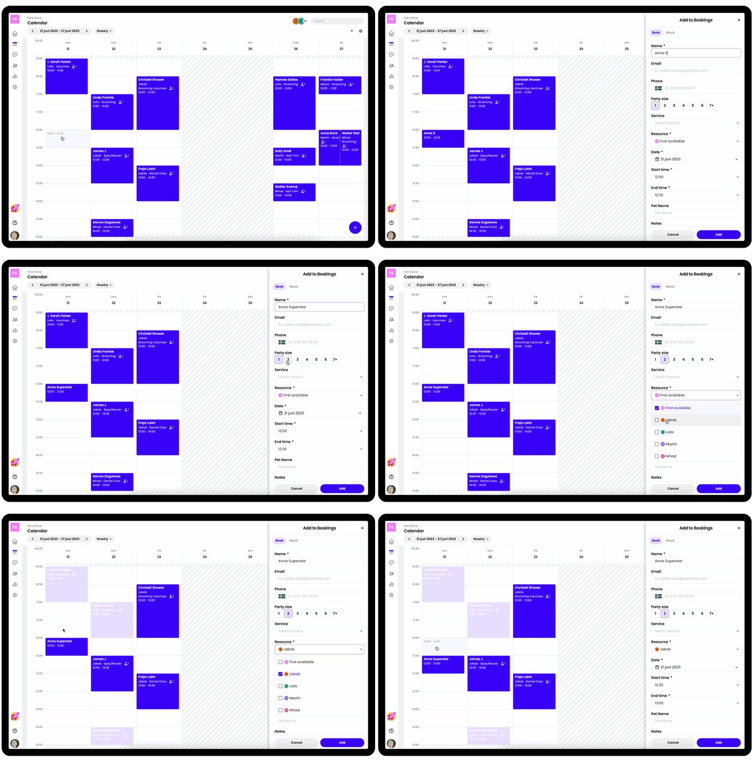
The new booking calendar is 3x faster with a much cleaner user interface. Fewer distractions and more capabilities - so you can get your appointments done quickly.
Better flow to create new bookings
Making a new appointment has never been easier. By highlighting other bookings relevant to the new booking and a more intuitive flow, you’ll be creating bookings faster than ever.
Jenny from the Block
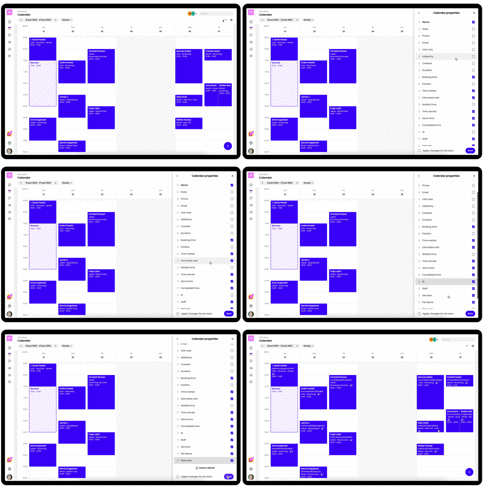
Blocking off time in your calendar is now simpler with the new Block tab. You can choose to block the whole day or pick a start and end-time for your block, plus pick if the block should apply to just one of your resources or everyone. Also, you can now change the block label to show more detail.

Choose what appointment info to show
You can choose what info for each appointment you’d like to see in your calendar. Choose to show the most important stuff first and hide the rest!
Guests will love your new Public experience
Joining your waitlist or making an appointment should feel completely frictionless for your guests. In fact, it should feel delightful and fully reflect your brand’s look & feel.
With this in mind we’ve rebuilt the Guest-facing Public pages from the ground up to make your guests happier and your brand stand out.
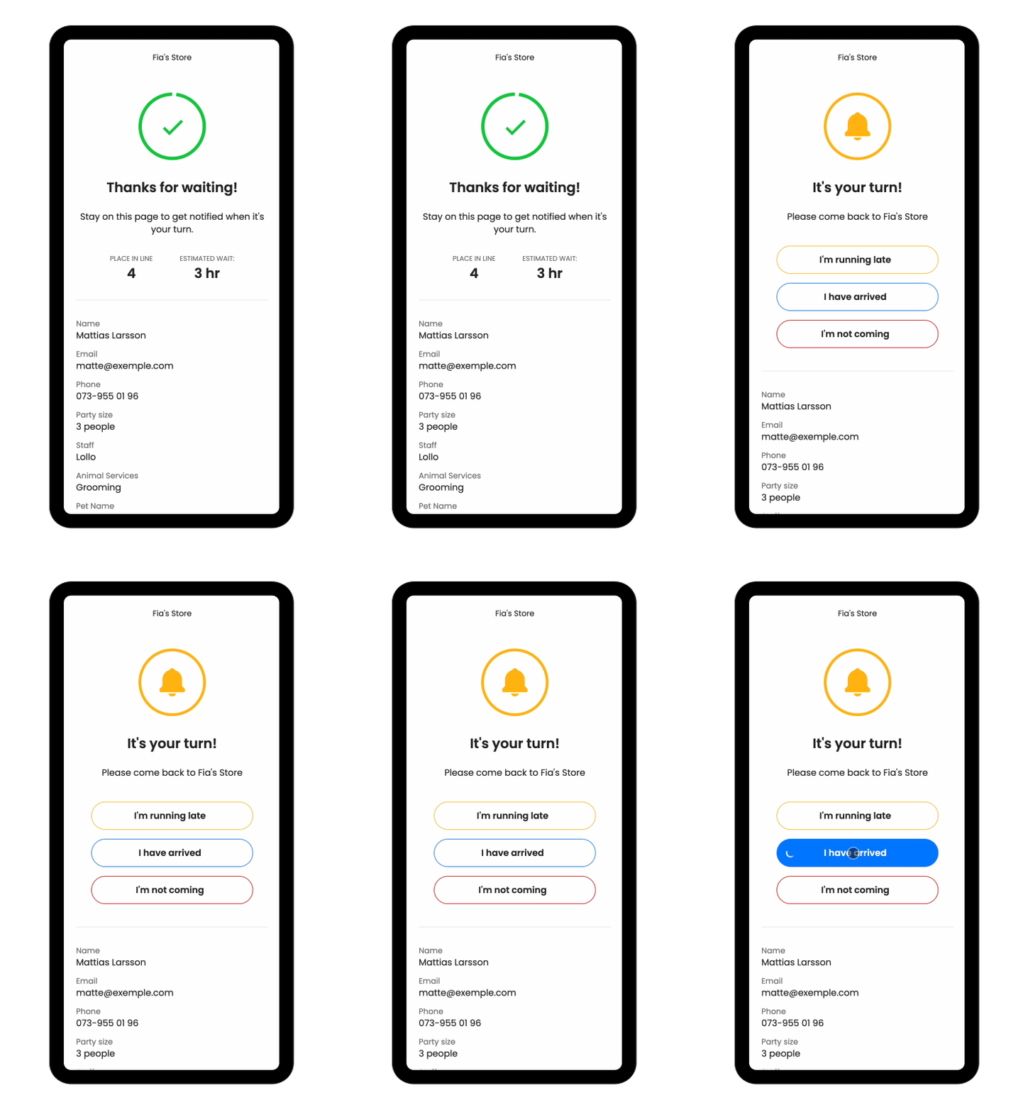
A more interactive status page
To help your guests keep track of their place in line or manage their appointment in real-time, we’ve made the Status page much more flexible and responsive.
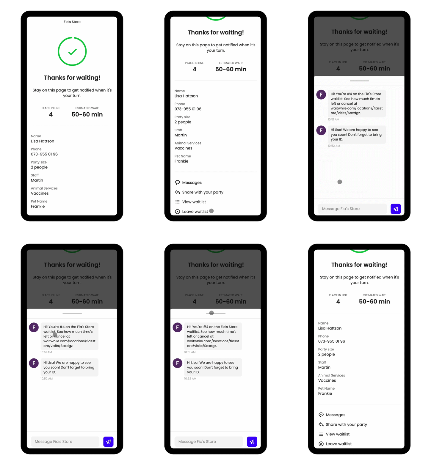
Let your guests chat with you
While your guest is viewing their place in line on the status page, why not let them also see your notifications and easily reply without leaving that page? That’s now possible with the new Messages feature.
Guests will now see a notification when you’ve sent them a message and they can see the full message history as well as reply from here.
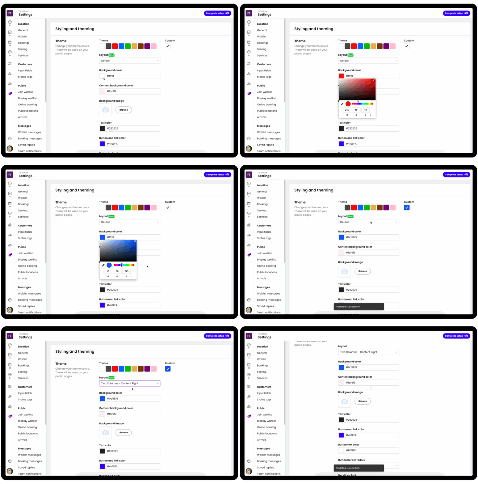
More theming options
Your public Waitwhile pages should feel like an extension of your brand so that your guest’s always feel like it’s your business they’re interacting with - and not Waitwhile.
To that end we’ve introduced a ton more flexibility for how to style and theme your guest-facing pages under Settings > Theme.
Display your Waitlist on the big screen with voice audio
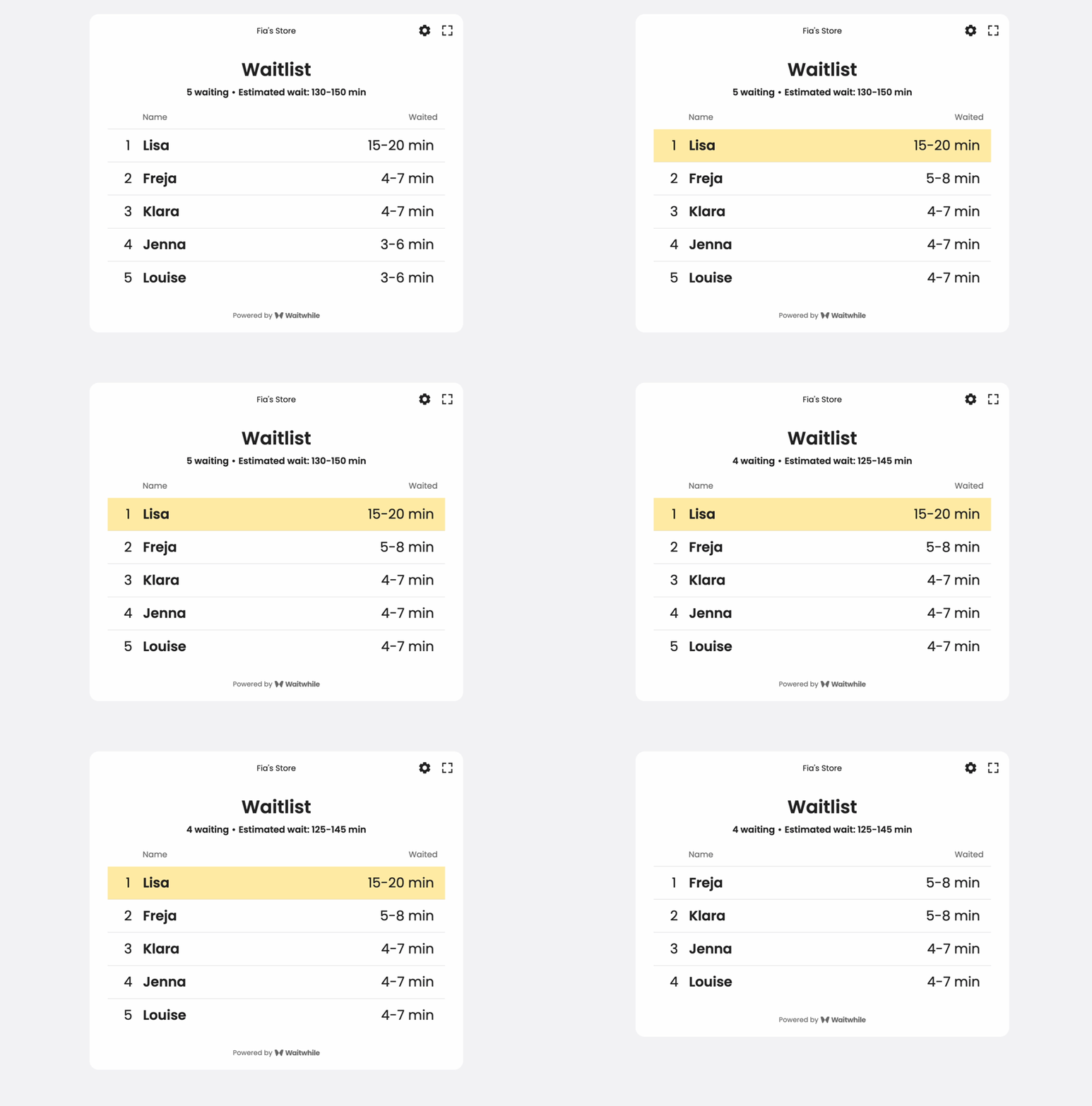
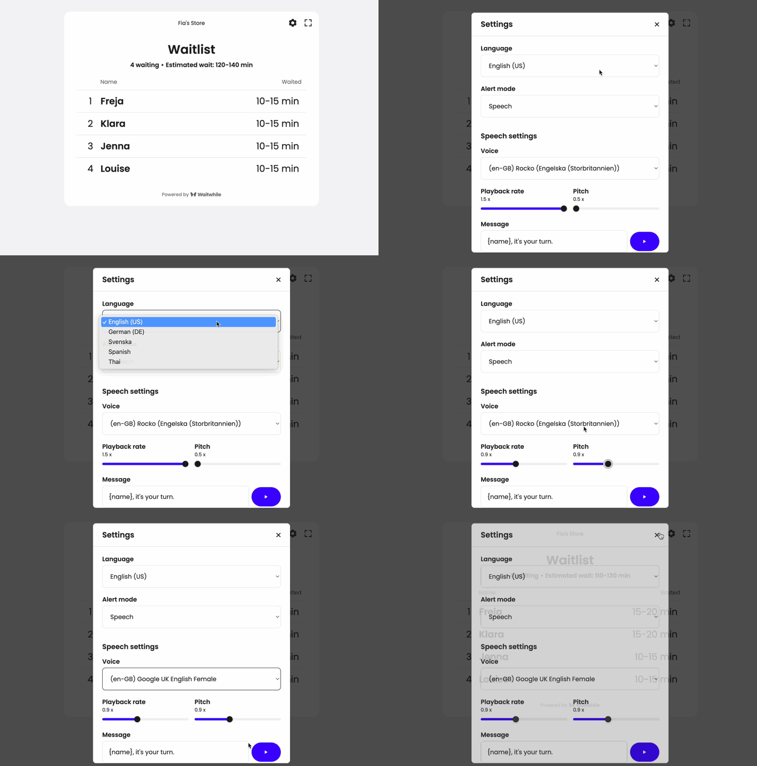
If you have a waiting area where you’d like to show your current queue on a TV screen for all your guests to see, you’re in luck. We’ve made a ton of improvements to this experience to make it more configurable and better looking.
We’ve also added support for Audio Announcements that can alert your guests with their name or ticket number using a natural-sounding voice.
Analytics & Reporting
View analytics for multiple locations
We now support showing Analytics for multiple locations in your account at once. Previously you could only view one at a time.
This lets you understand how your overall business is performing across all your locations.
Customer flows
Understanding how your guests flow through your experience is critical to understand where they are dropping off or where you have bottlenecks. We’ve now some powerful visualizations to measure your customer flows.
- Customer path: Visualize your customer flows from registration, through serving and completed visits. You can see where you get drop-off.
- Lead times: Break down your typical guest visit by how long they wait until getting summoned, how long it takes them to return when it’s their turn and how your staff takes to process them.
Optimize your resourcing
Waitwhile should help drive insights for your business to improve efficiency, reduce no-shows and optimize your staffing. To this end we’re adding several new powerful reports.
- Visit distribution to help you see your peak periods during your week with the most congestion, longest wait times and highest no-show rate. This helps you understand when to increase or reduce your resourcing to optimize your throughput.
- Line length to understand your max and average number of waiting parties during different times of the day or days of the week. If you consistently see long lines during certain hours, you should consider increasing your capacity.
Customize analytics widgets
Perhaps only some of the Analytics reports are useful to your business. Now you can choose to show only those that you care about in the Analytics display settings. This reduces clutter and helps you focus on the data that matters!
(Coming soon) A better Admin experience
In the fall, we’ll have a brand new powerful Admin dashboard to manage all your locations in a radically better way. This is especially helpful for large businesses using Waitwhile across dozens or even thousands of locations.
Locations overview
The new powerful Locations Dashboard will let you easily see all your locations in one place and monitor their performance at a glance.
Group locations together
You will be able to group locations If you have multiple locations that belong together, for example if they’re all part of the same region or used for different use-cases at a single store.
Easier to manage changes across locations
The new Account Settings page lets you easily make changes that affect multiple locations at once. Instead of having to update one location at a time, this now lets you quickly deploy changes across your entire account in a safe and easy way.
Report builder
Need custom reporting delivered right into your inbox every week? Our new Report Builder will blow you away. You can choose between thousands of metrics and entities to create the reports of your dreams.
Save your custom reports as templates and even schedule them to run automatically on your preferred frequency.
More coming soon! ⚡
Of course, this is not all. The best thing with Waitwhile 3.0 is that it provides a foundation that makes it much easier for our team to ship new features and make enhancements.
Got feedback or ideas on what you'd like us to build next? ❤️
As always, just shoot us an email to hello@waitwhile.com. We read every single message!
